Well, I have been lucky enough to have been picked to be on the Crafty Cardmakers DT!
I am both excited and nervous about this new responsibility, but I am looking forward to it and will definitely be doing my best. Watch this space!!
Xmas 2015

Monday, 3 October 2011

Totally Gorjuss Challenge 100 - a sketch
Totally Gorjuss have just issued their 100th challenge, which was a sketch and I thought I would have a go at it.
 Now, Sketches sometimes bamboozle me a bit, because I get obsessed about matching it exactly, but this time it seemed to go ok. The colours are a bit brighter than I usually favour - I'm so not a pink girl! - and I used paper and images given free in Making Cards magazine, along with a couple of extras from my stash. The paper flower and gems are also from my stash.


Sunday, 2 October 2011
Crafty Cardmarkers Design Team Call
Crafty Cardmakers are having a change of Design Team, and I have been pondering whether to apply. The deadline is 2nd October, so I am really leaving it up to the last minute to enter!. Having said that, nothing ventured, nothing gained.
It will be interesting to take on new challenges and perhaps develop my crafting if I am lucky enough to be picked.
We were asked to highlight three projects that showed off our style. My style actually varies with my mood, but rarely (unless we are talking butterflies or flowers) includes lots of embellishments. I'm currently into stamping and colouring, and using images from the various CDs I have bought.
I like to personalise my cards so they fit the person they are being sent to, and I do like to make cards that double up as something else. Ideally, they also work as a gift. So, without further ado, here are my three choices that showcase what I like to do.
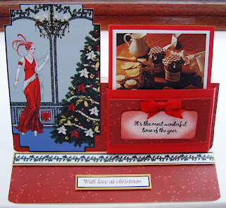
My first choice is an easel card that has a box for recipe cards. As this one was a Christmas Card, I included four specific recipes - Christmas mulled wine, Orange pastry, Traditional Mincemeat, and Mince Pies.
The Art Deco image was from a Debbie Moore CD and the recipes were from a Josceline Dimbleby book I've owned (and loved) for many years.
 My second choice is a really versatile card - you can use it for all occasions. Inspiration for it came from a very talented crafter called Marianne.
I have made one for a new baby, where the gift inside was a pair of baby socks, I have also made one for a wedding, and in that case the gift inside was a horseshoe with confetti.
This photograph is one that was a more general birthday card, and contains tealights.
The front decoration was created using some background paper from my stash. The butterflies were stamped and embossed onto the same paper and then cut out and sprayed with crafters companion spray and sparkle. I made the roses using promarkered paper and punches - I love making my own flowers - and they were then glazed.


Finally, the last item was a challenge - a card with the theme "New Beginnings". I have some new baby cards I could use, but as I have just made a card for someone who has just left their job, I thought that was very appropriate too.
 Nothing like changing jobs to make you feel life is starting over... so yes, New Beginnings.
I've never been part of a design team before, and honestly, have no expectations for this application - there are so many very talented crafters out there and I have no delusions about my own abilities! But as stated before, nothing ventured - nothing gained, and you never know, I may just be picked!! And if I am, I will do my very best.
It will be interesting to take on new challenges and perhaps develop my crafting if I am lucky enough to be picked.
We were asked to highlight three projects that showed off our style. My style actually varies with my mood, but rarely (unless we are talking butterflies or flowers) includes lots of embellishments. I'm currently into stamping and colouring, and using images from the various CDs I have bought.
I like to personalise my cards so they fit the person they are being sent to, and I do like to make cards that double up as something else. Ideally, they also work as a gift. So, without further ado, here are my three choices that showcase what I like to do.
My first choice is an easel card that has a box for recipe cards. As this one was a Christmas Card, I included four specific recipes - Christmas mulled wine, Orange pastry, Traditional Mincemeat, and Mince Pies.
The Art Deco image was from a Debbie Moore CD and the recipes were from a Josceline Dimbleby book I've owned (and loved) for many years.

I have made one for a new baby, where the gift inside was a pair of baby socks, I have also made one for a wedding, and in that case the gift inside was a horseshoe with confetti.
This photograph is one that was a more general birthday card, and contains tealights.
The front decoration was created using some background paper from my stash. The butterflies were stamped and embossed onto the same paper and then cut out and sprayed with crafters companion spray and sparkle. I made the roses using promarkered paper and punches - I love making my own flowers - and they were then glazed.
 .
.

My third choice is to show a more straightforward style of card, and is a birthday card. The main topper was in fact the sentiment and the interest really came from the patterned background paper and the paper flowers. There were very few fiddly bits on this card - simple matting and layering, only. I often make cards where the sentiment you would normally expect to find inside appears on the front as a focal point. I love my nesties for their versatility in doing this.


Finally, the last item was a challenge - a card with the theme "New Beginnings". I have some new baby cards I could use, but as I have just made a card for someone who has just left their job, I thought that was very appropriate too.

I've never been part of a design team before, and honestly, have no expectations for this application - there are so many very talented crafters out there and I have no delusions about my own abilities! But as stated before, nothing ventured - nothing gained, and you never know, I may just be picked!! And if I am, I will do my very best.
Saturday, 1 October 2011
New Beginnings - a Leaving card

This card was an A5 landscape card, with some grey stripey paper from my stash, layered onto a gunmetal silver card. The inverted corner punch gives a great effect with the backing paper - my new favourite thing!
The base layer for the image was stamped with a fish (not sure which set this came from *blushes*) and then the image itself, which was a digital image from Just-Inklined called Man at work. The image was coloured in using Promarkers.
The card was finished off with a greeting printed off on the computer, and a "Good Luck" peeloff.
Saturday, 17 September 2011
Snowy winter scene

Mum and I first saw this stamp at a promarker class we went to at In2Crafting at Wickford
In2Crafting run an online shop as well, but I would definitely recommend a visit to the shop as René and John who run it are super helpful.
Anyway, this image has been coloured using a combination of promarkers and spectrum noir pens. The glittery "snow" effect was achieved using a quickie glue pen and my trusty favourite - Glamour Dust!
Thursday, 8 September 2011
Winnie Polkadoodle owl

First, I coloured the background of the card, so I was positioning my image in correct colours, then I coloured in and layered the images I printed off with promarkers. I glued the fence so it curved slightly, which I think gave a good effect.
I do like the muted tones here, but stupidly didn't write down the colours.
I was pleased with the results though - not quite up to Nikki's standards, but quite passable for me!
Thursday, 25 August 2011
DL - landscape card
A friend of a friend is being honoured with the freedom of the City of London. My friend wanted a congratulations card that somehow incoporated the logo and the Freedom ceremony.

I cut two strips that were 4inches by 8 inches and one strip that was 4 inches by 10 inches. I scored the last strip in each side at the 1 inch mark so that I could then glue the two side strips onto it.

 Inside the card, I stuck an insert with a saying on it. All three folded in to make a card that fitted a DL envelope perfectlhy!

I cut two strips that were 4inches by 8 inches and one strip that was 4 inches by 10 inches. I scored the last strip in each side at the 1 inch mark so that I could then glue the two side strips onto it.
This made a DL card, but opening landscape. I embossed the front with the swirls embossing folder, and covered the join with spotty ribbon. I embossed the greeting with the Cuttlebug onto the same white card and sprayed it with Crafters Companion spray and sparkle in silver. This was stuck onto the front of the card using foam tape, over the ribbon.On the right hand side of the card front I used an EK Success punch along the edge, and stuck a black ribbon tab on the centre, with a brad.

On the inside left cover, I used a downloaded copy of the logo cut out with a nestie label die to cover the join in the ribbon. On the right hand side flap, I used promarkers to make a backing layer, and stuck onto that the Freeman's oath.
 Inside the card, I stuck an insert with a saying on it. All three folded in to make a card that fitted a DL envelope perfectlhy!
Thursday, 18 August 2011
CD Sunday Challenge - Ovals

The bow is made from organza ribbon, and was tied round the poppy paper before the topper was put onto the DL card.
I am entering this card into the CD Sundays Challenge - Only Ovals.
Friday, 5 August 2011
Birthday beefcake...

Techniques used are a combination of printing images snagged from online, a digistamp from Mo Manning that was coloured in using promarker skin tones, and embossing using the Creative Expressions brickwall embossing folder in my 'bug.
The base card was white, and I printed onto cardstock the England badge background. This was then trimmed and put into the embossing folder. The brick edges were then highlighted using Cool Grey 1 promarker.
The brick embossed sheet was trimmed and the edges rounded off and then mounted on red mirri card.
More red mirri card was used to mount the happy birthday sentiment.
My strong man was shaped and then attached to the front of the "wall" using pinflair glue. Finishing touches were the two flags that represented the family heritage.
Monday, 1 August 2011
In the garden
I am entering this card into Sentimental Sundays - Challenge 66 and Polkadoodles week 30 challenge - in an english country garden
This card is a double twisted easel, incorporating stamping, colouring with promarkers and spectrum noir pens, die cuts and marbled paper. It fits into a standard DL envelope.

The base card was plain white cardstock, measuring 8 inches square, and scored in half. I used marbled paper (marbled using the My craft studio marbling inks) for the base of the card. The base was decorated with two swirls (cuttlebug die) and the stopper was white card with the edges distressed in shabby shutters, and matted with the same paper I used for the toppers. A sentiment from hero arts was stamped on the centre of it, and the two corners were a clarity stamp.

Each of the easels were 4 inches square, with the corners rounded. I distressed the edges using shabby shutters distress ink. I then used a nestie to provide a shaped layer in complementary paper, and matted the two toppers onto that.
The first topper (on the left) was one of the free downloads from the Sentimental Sunday website, with the edges distressed using shabby shutters, and the flowers coloured using a mixture of promarkers and spectrum noir pens.
 The second topper (on the right) was a sarah jane clear stamp. I coloured the image in using a combination of promarkers and spectrum noir pens, and again distressed the edges using shabby shutters. The small butterfly was from my stash.
I didn't put a specific sentiment on there - it can be a birthday, a get well, or just a thinking of you card that way.
This card is a double twisted easel, incorporating stamping, colouring with promarkers and spectrum noir pens, die cuts and marbled paper. It fits into a standard DL envelope.

The base card was plain white cardstock, measuring 8 inches square, and scored in half. I used marbled paper (marbled using the My craft studio marbling inks) for the base of the card. The base was decorated with two swirls (cuttlebug die) and the stopper was white card with the edges distressed in shabby shutters, and matted with the same paper I used for the toppers. A sentiment from hero arts was stamped on the centre of it, and the two corners were a clarity stamp.

Each of the easels were 4 inches square, with the corners rounded. I distressed the edges using shabby shutters distress ink. I then used a nestie to provide a shaped layer in complementary paper, and matted the two toppers onto that.
The first topper (on the left) was one of the free downloads from the Sentimental Sunday website, with the edges distressed using shabby shutters, and the flowers coloured using a mixture of promarkers and spectrum noir pens.
 The second topper (on the right) was a sarah jane clear stamp. I coloured the image in using a combination of promarkers and spectrum noir pens, and again distressed the edges using shabby shutters. The small butterfly was from my stash.
I didn't put a specific sentiment on there - it can be a birthday, a get well, or just a thinking of you card that way.
Christmas Robin
I know, we are finally getting some warm weather! But I had a fancy to play with some of my Sheena Douglas stamps and have a go at a card with no layers. Scary! I did have a plan, though. If any of the colouring or stamping had gone majorly wrong, I would have layered another version over the top!
 In the event, though, it all went well.
I did the stamping first, using a memento black ink pad - this was because I wanted to use my promarkers. The sentiment was stamped in the bottom right hand corner. On reflection, I think I could have got that a bit more straight, but it wasn't bad enough to have to cover it up!
The foliage stamp was used to create the effect of a tree. It should perhaps have come further out - the bit the bird is sitting on looks a bit sad, but I didn't want to take anything away from the main image of the robin.
 The background was shaded using a combination of faded jeans distress ink, and one of the big and juicy pads. To get the moon, I used a mask made from a circle punched from a post it note . I used the inkylicious blending dusters to get the light effect - I find I am a bit too heavy handed with the cut and dry foam...
 I was pleased with the way the robin turned out. My blending can be a bit hit and miss, to be honest. I need to practice more! My mum loves colouring and has it down to a fine art but I am more of a novice.
To finish it off, I stamped a greeting across the moon and then sprayed the whole thing with some silver spray and sparkle from crafters companion.

I did the stamping first, using a memento black ink pad - this was because I wanted to use my promarkers. The sentiment was stamped in the bottom right hand corner. On reflection, I think I could have got that a bit more straight, but it wasn't bad enough to have to cover it up!
The foliage stamp was used to create the effect of a tree. It should perhaps have come further out - the bit the bird is sitting on looks a bit sad, but I didn't want to take anything away from the main image of the robin.


To finish it off, I stamped a greeting across the moon and then sprayed the whole thing with some silver spray and sparkle from crafters companion.
Saturday, 30 July 2011
She's leaving home...
A friend of mine has been wanting to downsize for quite a while - her 4 bedroom house was just too big now her children are all grown up and married with homes of their own. Anyway, she finally managed to do it and has moved to a 2 bedroom ground floor flat instead.
 I did her a welcome to your new home card, trying out the new Spectrum Noir pens (which I have to say, work perfectly with the promarkers I already have). This card was made using a stamp I've had for years, plus some backing paper printed off from the MCS encyclopaedia cds onto card for the base.
The little bird was made using self adhesive peel offs - there are two sets, one outlines, and one outlines and centres in double sided tape. I didn't have glitter in the colour I wanted, so I used the miniscule balls... I liked the texture very much.
The lace strip was made using a Martha Stewart edging punch, and the sentiment was printed out on the computer.

The little bird was made using self adhesive peel offs - there are two sets, one outlines, and one outlines and centres in double sided tape. I didn't have glitter in the colour I wanted, so I used the miniscule balls... I liked the texture very much.
The lace strip was made using a Martha Stewart edging punch, and the sentiment was printed out on the computer.
Tuesday, 26 July 2011
CD Sunday challenge - Dreams

Ordinary copy paper was used with a Martha Stewart edger punch to make the lacy "ribbon".
Just some Lines Challenge - easel cards
I like making easel cards, you get so much more to decorate! This is a twisted easel card made for Mothers Day, where the "mother" isn't actually your mother.
 For this card, a pale green/grey base card was used and a topper from a sheet I had in my stash (It may have been from Hunkydory, or Sue Smith).
Quicky glue pen and glamour dust was used to enhance the flower on the topper. The base of the easel was stamped with a swirl from Clarity Stamps, and some paper roses and leaves, made using punches. The butterfly was stamped onto acetate and glittered. So that the colour I wanted for the layer cards was matching, plain white card was coloured with promarkers.
 For this card, a pale green/grey base card was used and a topper from a sheet I had in my stash (It may have been from Hunkydory, or Sue Smith).
Quicky glue pen and glamour dust was used to enhance the flower on the topper. The base of the easel was stamped with a swirl from Clarity Stamps, and some paper roses and leaves, made using punches. The butterfly was stamped onto acetate and glittered. So that the colour I wanted for the layer cards was matching, plain white card was coloured with promarkers.
Saturday, 23 July 2011
Passion for Promarkers Challenge - Sketch
I thought it was about time I joined in some challenges. And since I love my promarkers, this one seemed a good one to start off with!
I made this card using the sketch provided.

The backing paper was from my stash, distressed at the edges with Faded Mahogany distress ink pad. The check and peach card were also from my stash. I cut some acetate the same size as the check card and stamped the corner with a swirl and attached it to the card with a brad. The flowers were punched, and a gem stuck in the centres. The bear was coloured with skin tones promarkers (I forgot to note the colours!) and was then cut out using the cuttlebug.
The lace is my standby paper lace, and the butterfly was stamped onto acetate and enhanced with gilding flakes.
I made this card using the sketch provided.

The backing paper was from my stash, distressed at the edges with Faded Mahogany distress ink pad. The check and peach card were also from my stash. I cut some acetate the same size as the check card and stamped the corner with a swirl and attached it to the card with a brad. The flowers were punched, and a gem stuck in the centres. The bear was coloured with skin tones promarkers (I forgot to note the colours!) and was then cut out using the cuttlebug.
The lace is my standby paper lace, and the butterfly was stamped onto acetate and enhanced with gilding flakes.
Pretty in pink
Little girls like pink for some reason, don't they? I had to make a 6th birthday card for a colleague's grandaughter recently, and naturally the spec was for pink and glitzy.
 This card is a twisted easel (my favourite style right now). I used backing paper and fairy images (body of fairy was decoupaged - but you can't see that in the photo) from Making Cards magazine, and pink glitter card to layer. I used a Wink of Stella clear pen to give the wings a shimmer.
 I stamped the name on the glitter card and cut out the letters. The tag with "6" on it was made from the backing paper stuck onto glitter card with a large silver peeloff. The greeting was a peeloff stuck onto the glitter card.


Birthday turtle card
I often struggle with cards for children. And men...
I've had to do a couple of children's cards recently though - this is the one I did for the one year old. Of course, he won't actually have it - at that age it's more for the parents to keep in a box, isn't it?
 This was a twisted easel card, made using plain white base cardstock. I used paper and topper from Making Cards magazine, and also some "googly eyes" from The Range. The flowers were punched, the small ladybirds were from my stash and the letters making up the name were stamped and cut out.
 Because I wanted to match the colours, I used plain white card for the layers, promarked to the shade I wanted along the edge.
The sentiment on the base card was a clarity stamp, and I used peeloffs for the greeting on the front topper.
I've had to do a couple of children's cards recently though - this is the one I did for the one year old. Of course, he won't actually have it - at that age it's more for the parents to keep in a box, isn't it?


The sentiment on the base card was a clarity stamp, and I used peeloffs for the greeting on the front topper.
Sunday, 17 July 2011
New Baby Girl card

I had a bit of a mental blank at first, but finally remembered I had some clear stamps of small hands and feet - and a neat sentiment.
I used pink tartan as the background paper, matted onto a plain pink to provide a narrow border, and an ~A5 portrait white base card. I used a small flower punch to make a pink "ribbon" for the bottom of the card, and used the flowers to make a similar border at the top.
The topper was made with a nestie label number 1 in the same pink as the base layer, and a nestie label number 5 for the centre which was stamped with the images. Both layers were distressed with Victorian Velvet distress ink before being layered. I used foam pads to add some height to the white label number 5.
A small pale pink bow was used at the top of the base layer, and a strip of paper lace was used across the card underneath the topper where the final sentiment was placed, using pinflair glue gel.
There are also two embossed lines top and bottom of the base card, but it isn't very clear from the photograph.
Summer Crafting at Doncaster
I made a spur of the moment decision to go to this show yesterday - about a 380 mile round trip. I must be mad! Petrol cost me about £45, plus the spend when I was there... yup, mad.
But! I got some new polka doodles stamps and ultimate graphic paper (and what a star Nikky is!!! Full of tips and helpful advice)

I also got some labels five nesties with rubber stamps from the stamp man that fit them perfectly. I got practically my mum's body weight in plain card (not mine - it wouldn't have fitted in the car *grins*) and a £10 goody bag from the create and craft stand. This bag was really good value - included a multi purpose heat tool as well as a craft knife set, peeloffs, glitter, many 3 d embellishments, 3 packs of speciality papers and a big block of decorative card. Also as I am a club member I got an extra pack of goodies worth £4.99.
After housework today I am going to play with my new stash. Woo hoo...!!
But! I got some new polka doodles stamps and ultimate graphic paper (and what a star Nikky is!!! Full of tips and helpful advice)

I also got some labels five nesties with rubber stamps from the stamp man that fit them perfectly. I got practically my mum's body weight in plain card (not mine - it wouldn't have fitted in the car *grins*) and a £10 goody bag from the create and craft stand. This bag was really good value - included a multi purpose heat tool as well as a craft knife set, peeloffs, glitter, many 3 d embellishments, 3 packs of speciality papers and a big block of decorative card. Also as I am a club member I got an extra pack of goodies worth £4.99.
After housework today I am going to play with my new stash. Woo hoo...!!
Monday, 11 July 2011
Creative Expressions Calling Card Challenge
 These are the basic materials to make this calling card (ATC) focussed card.
The base card was a hammered white card cut down to 6" by 6" size, with the edges coloured with Faded Mahogany distress ink. On this occasion, as I wanted a heavier colour, I used a cut and dry foam pad. If I had wantedthe colour to be lighter, I would have used an ink duster (from Inkylicious) as I find they give me a more delicate effect.
 I used plain card distressed around the edges with Aged mahogany distress ink for the calling card. Onto the centre I stamped a daisy flower, which was coloured with a combination of distress inks and water color pens, and around the edges of the card I used one of Clarity stamps (the swirl pattern).
The sentiment came (I think) from a Hero Arts stamp set. In the centre of the daisy I put a gem. (It started as a crystal, but ended up a pearl!).
The other background layer was cut by a nestie, and using a paper from a Crafty Individuals background papers pad, Book 1. The edges were distressed with the same coloured stamp pad as the base card. I also used a strip of the cool stick on paper lace from Kars.

TOP TIP - if you use the same paper for punching out flowers as the backing paper, you can ensure that the colours match.
First, distress the edges of the base card, which has been cut to be 6" by 6". I have used Aged Mahogany distress ink by Tim Holtz. Then put down the first layer. I have used a deep red textured paper with a shiny finish. This colour toned in with the faded mahogany distress ink, and provided a striking contrast.

 The next step is to layer on top of the red card the decorative paper.
 For this, I chose a sheet from Life's Journey paper pad from K&Company. I've had the pad a fair while, so it might not be available any more...
I like to round the edges on my papers with the corner punch - to me it looks nicer than square.
I put the layer to the left hand side, so that my lace strip could go down the right hand side, showing the red through it. Finally, I put the nestie shape onto the backing paper at a jaunty angle, using foam tape to raise it from the backing.


Subscribe to:
Posts (Atom)